Revolution has been responsively designed to allow for ideal performance on any device. Whether on a phone, tablet or desktop, the entire site will adapt in display and functionality. Plus, an update to the account management pages in May supports mobile uploading of profile pictures.
With approximately 70% of Reps accessing their back office from a mobile device, this responsive design ensures they can access their tools from anywhere, even without a native mobile app.
Pro Tip: Add a shortcut to the home screen on your device, to quickly access Revolution with one touch.
- Menu/Navigation
While site navigation is across the top of the screen on desktop, it collapses into what’s known as a ‘hamburger menu’ when viewed on mobile. This menu style is used on native apps, resulting in an app-like experience on the mobile responsive site.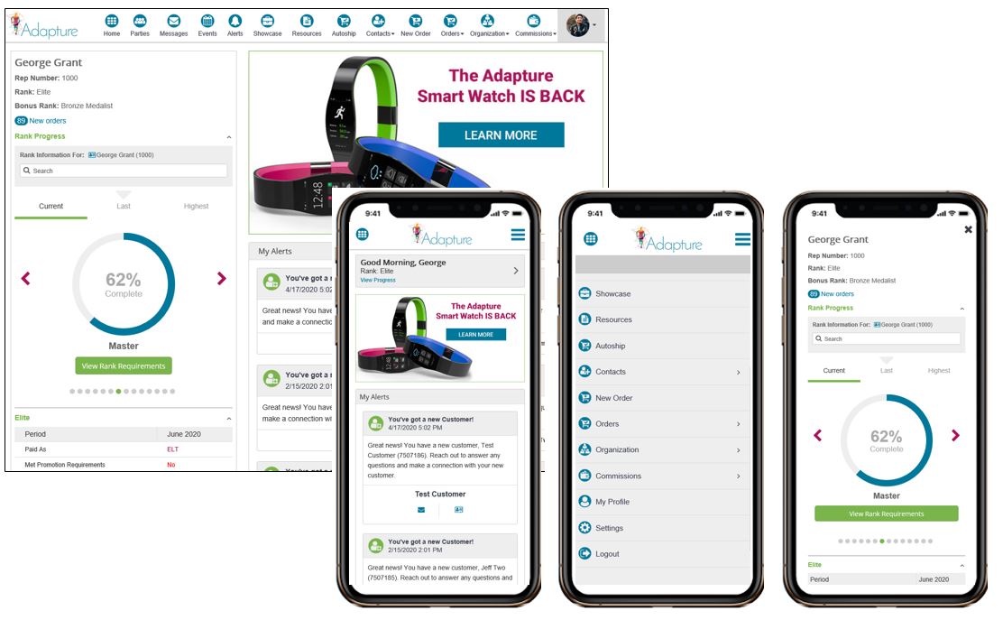
Pro Tip: When viewed on a mobile device, the home page/dashboard will display the right side only. To access the left side, tap on the grey greeting box at the top of the page. When finished, tap the X to close the left side. - One-Click to Connect
The contact information for individuals is accessible by clicking to view on desktop. On mobile, however, that contact information becomes one-click options to call, text or email using the device’s native phone/email apps.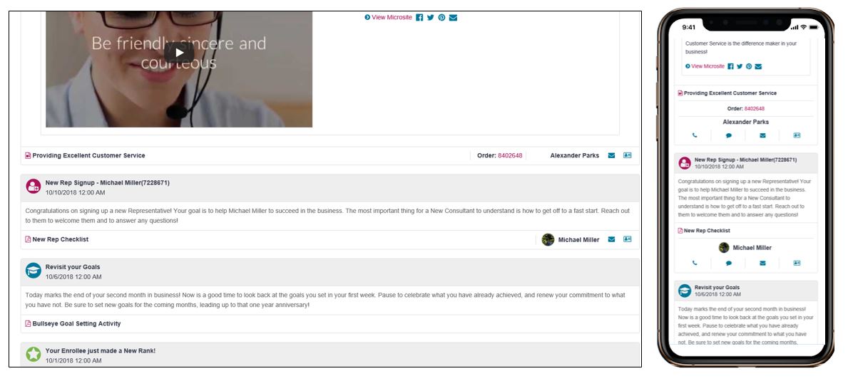
- Page Views/Layouts
Reports, volume listings, order details and other pages throughout Revolution adjust in format when viewed on mobile. Information stacks automatically, with filtering options becoming simple buttons at the top of the page. Additionally, the user can choose to toggle to a vertical view instead of the horizontal view, to avoid side scrolling.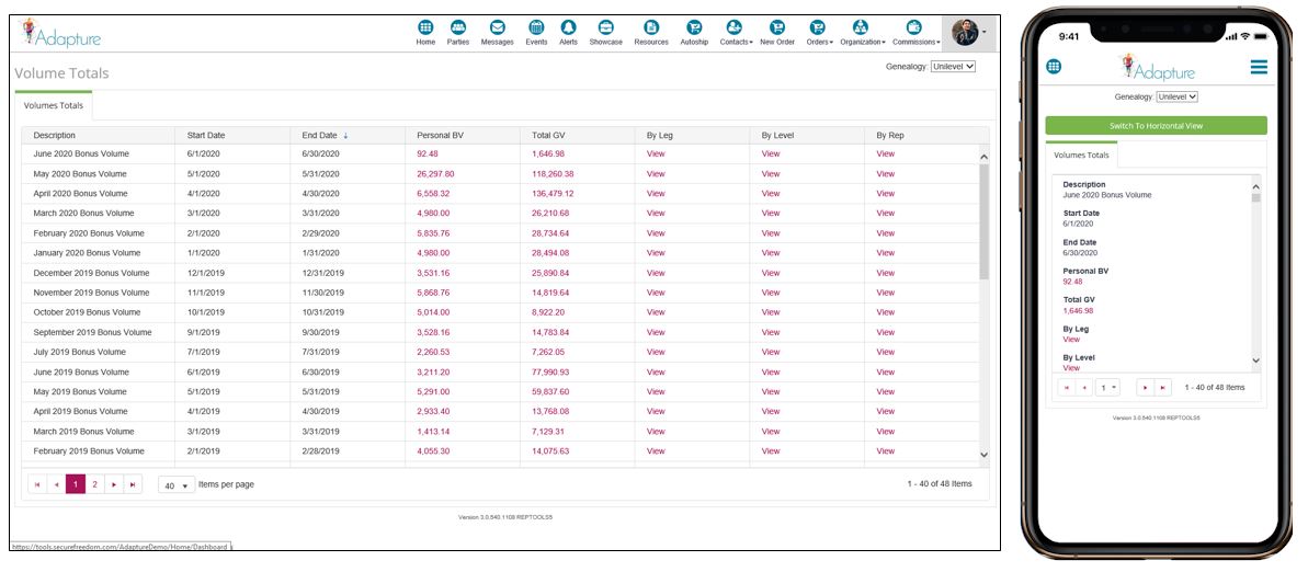
Reach out today to learn more about these options, and for support and configuration assistance on these tools. Plus, be sure to share these tips with your Reps, so they can get the most out of their online back office tools.